Create a Twitter-like logo
I recently upgraded the look of the TwitterRatio site. The charcoal look was okay for starters but I wanted to make it look more Twitter-like, something that I’d noticed that a lot of other Twitter utility sites had been doing. In the process I created a Twitter-like logo and thought I’d share how it was done in case one of you loyal readers was wondering just how to make a Twitter-like logo for yourself. Additionally I thought it was about time to impress you once again with my less than adequate design skillz.
I use an old version of Photoshop 7.0 that I’ve had for years. For the minor “design” (psuedo-design-like in my case) things that I do it has more than enough functionality and I find no need to upgrade. You should be able to do something similar with Paint Shop Pro, Gimp or any other graphics editing software. I tried to do something similar with Paint.NET but I’m just not familiar enough with it to be successful.
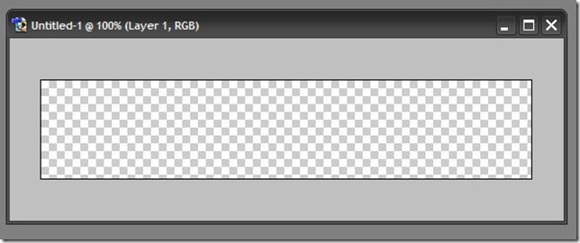
1. Create an empty canvas. I chose a transparent background approx 400px wide x 100px tall.
2. Add Text.
- Choose a font that closely resembles the Twitter font. I’ve read conflicting stories on the internet about which exact font Twitter uses (I’m sort of a font nut, which is kind of weird for a developer). One story is that the font is a hand tweaked version of the Chickens font from SparkyType foundry. Another is that it’s a tweaked version of the Pico font. Either of those is suitable and another similar (and free one) is Tondo. I’m using Pico.
- Choose a color of blueish-green that is close to the Twitter color scheme. I chose to use a different shade of blue for each word.
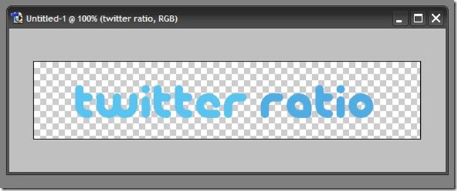
3. Rasterize the text layer by clicking on Layer > Rasterize > Type in the menu.
4. Select just the text by doing a Ctrl + click on the text layer (in the layers “widget”). Notice the dancing ants! It makes me want to fire up some Dave Mathews.
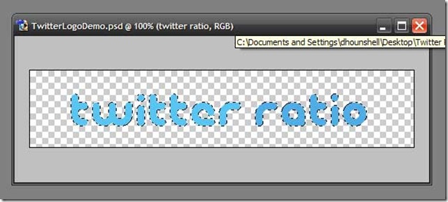
5. Expand the selection in preparation for adding a “halo” around the text. Do this by going to the menu and clicking Select > Modify > Expand > 6px.
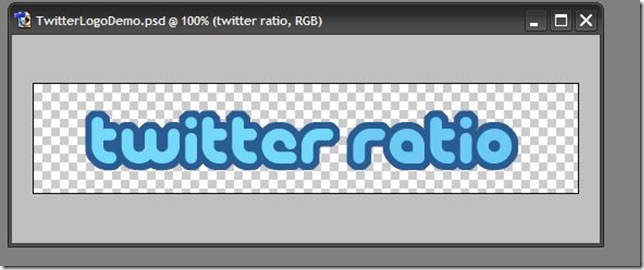
6. Apply a color to fill the selection to create the halo. I chose to go with a darker blue color rather than the white that Twitter uses. I thought it looked better with my site colors, but do as you see fit. Apply the fill by going to the menu and clicking Edit > Fill. In the popup change the Mode to Screen and select a color. Hit OK.
Note: You may need to apply #6 above to a new layer and move it below the text layer. I did not need to for the dark blue halo, but I did when using white. I have no idea what I did differently. I really don’t know how Photoshop works, I just keep pushing buttons until I have something suitable.
Note: Rather than expanding and filling as I have explained you can use an outside stroke to create the same effect.
Example with darker blue border (you can see it use on the TwitterRatio site):
The real Twitter logo is below. You can see that there are some slight differences between the font in the Twitter logo and the Pico font. The w, i, and r all look to be right on. The middle t’s are very close, but they seem to have a little bit of a tilt to the left in the Twitter logo. The e’s are way off. But, hey, it’s close enough for my purposes.

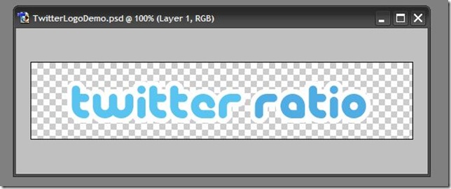
For completeness sake, here is an example with a white border, which looks more Twitter-like but doesn’t suit my site as well:
Enjoy and happy Twitter-like logo making!