Create an iPhone styled slide-out Social Locator
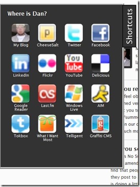
The post iPhone look-alike on your kitchen wall on Hackaday inspired me to create a slide-out Social Locator for my site. If the iPhone interface is intuitive and recognizable enough to be used for a kitchen computer then it is probably a good model for anything. The “social widgets” on my home page are cool (to me) but if all a visitor to my site wants to do is find the link to my Facebook page there is way too much stuff to wade through. I wanted a quick and easy way to provide links to my online locations without cluttering up the page. I decided to use the “slide out” model and I realized an iPhone style interface would be perfect for it. Below are some screenshots of the closed and open state, but you can see the widget in action on my home page (or any page on my site) by clicking the “Shortcut” tab on the left hand side of the page.
What is a Social Locator?
I don’t know – I just pulled the name out of thin air on the fly. It sounded like a good term for what I’m trying to do – provide a widget with links to my online places. Why the iPhone-like interface? Because most people get it. The little icons and text provide a hint and brief description of what the links are and you click on one to go to that place. I can’t think of an easier interface to use than that.
My 18-year old son, who is pretty tough to impress, said “That’s the coolest thing I’ve ever seen!” I don’t know if I’d go that far, but I don’t mind that for once he thinks that I have some amount of coolness. I don’t necessarily need to provide a tool for “everyone” who is looking for me online – my Mom, wife and kids know where to find me just fine. But I thought it was cool enough to share and someone might find it useful on their own site.
How it works
If you’ve read any of my last few posts you know where I’m going with this – jQuery! I went looking for a slide out plugin for jQuery and found the tabSlideOut jQuery plugin. It was everything that I needed and nothing more. Now that I had the base functionality I needed some iPhone styled icons. I was afraid I was going to spend a few hours in Photoshop but another search brought me to the iPhone-like icon maker. This is a very slick online tool and was perfect for the job at hand. The instructions say to provide a 512x512 image, but I found that even 16x16 favicon’s (converted to png with the help of the “hidden” Google favicon to PNG converter) were good enough for creating the 50ishx50ish sized icons that I needed.
I grabbed the jquery.tabSlideOut.v1.3.js script and added it to my site, created script references on the page to the jQuery library and the tabSlideOut script and then followed the rest of the instructions for implementing the tabSlideOut plugin. I added some CSS to make the output look iPhone-like and that was it. Below is the javascript to wire everything up, the HTML for the popout panel, and the CSS to make it look iPhone-like.
<script type="text/javascript"
    src=”http://ajsax.googleapis.com/ajax/libs/jquery/1.3.2/jquery.min.js”></script>
<script type="text/javascript" src=”jquery.tabSlideOut.v1.3.js"></script>

<script type="text/javascript">
$(function(){
    $('.slide-out-div').tabSlideOut({
        tabHandle: '.handle',    //class of the element that will become your tab
        tabLocation: 'left',     //side of screen where tab lives, top, right, bottom, or left
        speed: 300,              //speed of animation
        action: 'click',         //options: 'click' or 'hover', action to trigger animation
        topPos: '40px',          //position from the top/ use if tabLocation is left or right
        leftPos: '20px',         //position from left/ use if tabLocation is bottom or top
        fixedPosition: true      //options: true makes it stick(fixed position) on scroll
    });
});
</script>

<div class="slide-out-div">
    <a class="handle" href="http://danhounshell.com" title="Click Me!">Shortcuts</a>
    <h3>Where is Dan?</h3><br />
    <div class="button">
        <a href="http://danhounshell.com/blog" title="My blog">
            <img src=danhounshell.png" alt='My Blog' width='57' height='57' />
        </a>
        <div>My Blog</div>
    </div>
    <div class="button">
        <a href="http://twitter.com/danhounshell" title="Twitter">
            <img src="twitter.png" alt='Twitter' width='57' height='57' />
        </a>
        <div>Twitter</div>
    </div>
    <!—More Links go here, left out for brevity -->
    <div class="button">
        <a href="http://whatiwantmost.com/diggerdanh/Wishlist.aspx" title="WhatIWantMost">
            <img src="wiwm.png" alt='My Wishlist on WhatIWantMost' width='57' height='57' />
        </a>
        <div>What I Want Most</div>
    </div>
    <div class="button">
        <a href="http://graffiticms.codeplex.com/" title="Graffiti CMS">
            <img src="graffiti.png" alt='Graffiti CMS on CodePlex' width='57' height='57' />
        </a>
        <div>Graffiti CMS</div>
    </div>
</div>

.slide-out-div {
    padding: 20px;
    width: 312px;
    background: #333;
    border: 5px ridge #ccc;
    color: #fff;
}
.slide-out-div .button {
    float: left;
    width: 67px;
    height: 77px;
    overflow: hidden;
    text-align: center;
    margin: 5px;
}
.slide-out-div .button div {
    font-size: .9em;
}
a.handle {
    background-image: url("images/shortcuts_tab.gif");
    height: 122px;
    width: 40px;
}
Leave a comment and let me know what you think of my new “Social Locator”. If you’d like, use these instructions to create one for yourself. Give me a shout if you have any questions.

