Technical Writing, Experts, Reviews & Proofreading
Last weekend I read two books, one had to do with developing using web standards and another was Professional Development with Web APIs : Google, eBay, Amazon.com, MapPoint, FedEx
I was prepared for the API book to be a fairly lightweight book, focusing more on finding information/documentation about the mentioned APIs and doing some basic work with them than detailed code examples. And that is exactly what I found. Generally it was a pleasant read and I thought it was worthwhile. Yes, for the most part, everything in the book can be found on the Internet. However, sometimes it is worth spending a couple of dollars to pay someone else to do all the research (or a good part of the basics) for you. Plus it is nice to sit down and read everything all in one book - for the convenience and just for the pleasure of reading a real book.
However, I also found a something that I was not prepared for. I felt there was a lack of proofing/reviewing done for this book and in particular there was a big mistake that I feel should never have been allowed to make it into a web expert’s book. I’m not certain that the author is a web expert, but she has written a book about Web APIs and provided ASP.NET code examples implementing those APIs so she should be.
There were a couple of misspellings here and there in the text that aren’t worth mentioning and there were a couple of errors with source code listings. They really aren’t that big of a deal, but I really am particular about those sorts of things - I notice them.
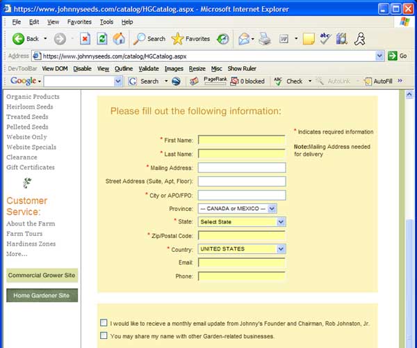
The “big” issue that I referred to earlier: there were several IE screenshots presented in the text showing forms with some of the fields having a yellow background color. Here is my generic re-creation as an example:

In several instances these images had captions similar to the following:
“There is no reason why the First Name and Last Name fields in the figure have a different background color. This appears to be a bug in Internet Explorer.”
and
“Again the First Name and Last name fields are not supposed to be displayed in a different color. This appears to be a bug in Internet Explorer.”
The first time I read this I said “What?!? You gotta be kiddin’ me!” (because I talk with a little bit of SW Ohio lazy diction, of course.) In the images you can plainly see the Google Toolbar displayed! I did not even use Google Toolbar before today (I installed it so I could take the above screenshot), but even I know that the yellow-colored fields are an indication from the Google Toolbar that those fields are capable of AutoFill. I know that from just working with people who do use Google Toolbar.
The book was published in April 2005 so in giving the author and reviewers the benefit of the doubt, the Google Toolbar might have been fairly new to them. But that said, you simply cannot let something like that make it to print. It is unacceptable. I don’t place blame entirely on the author, in fact I probably place more blame on whoever should have been doing the technical reviewing. It doesn’t matter really who gets the blame, though, because as soon as a reader sees something like that the book begins loosing credibility and every misspelling or other fault continues to wear away at whatever is left afterward.
Authors: please, please make sure you get some competent technical reviewers combing your manuscripts. And if you find yourself running short, I’ll always be glad to review as well (especially if it falls in the .NET or general Web realm).
